


Researchers are turning to satellites and machine learning to track how people are doing at the local level, offering a sharper view than national averages. The work spans thousands of municipalities and aims to guide targeted policy choices where they can matter most.
“Researchers are using satellite imagery and machine learning to map human well-being in thousands of municipalities, revealing local disparities in national data and guiding targeted policy decisions.”
The approach seeks to answer a pressing question: where do needs differ inside a country, and how fast are those needs changing. By replacing slow, national snapshots with timely local estimates, the project promises to help leaders act sooner and measure results more often.
Why Local Detail Matters
National indicators can hide deep gaps between neighborhoods, towns, and regions. A country may post gains overall while some cities fall behind. Traditional surveys and censuses are vital, but they are expensive, infrequent, and often delayed by years.
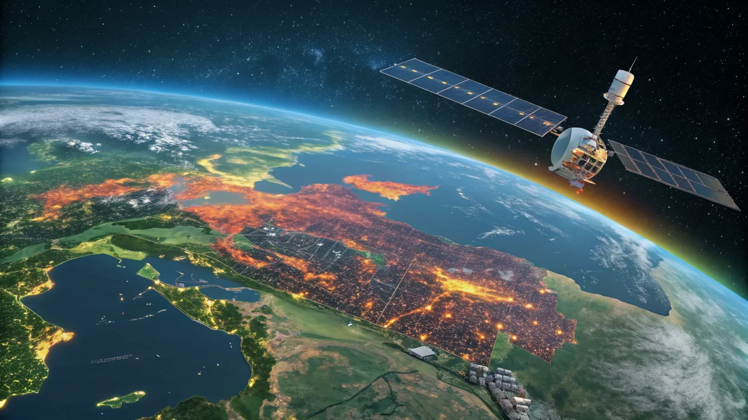
Remote sensing and machine learning offer faster updates. Satellite images capture patterns that track with living conditions. Models trained on ground data can estimate well-being in places where surveys are rare or outdated.
How The Method Works
The research links visual cues from space with measures of human well-being gathered on the ground. Features in the images are turned into signals that models can read and compare across time.
- Nighttime lights can proxy for economic activity.
- Roof materials and building density hint at housing quality.
- Roads and travel times suggest access to services.
- Vegetation and surface water signal environmental stress or resilience.
The models look for patterns shared by places with known outcomes and then estimate values in locations without recent surveys. Regular satellite passes allow updates every few months, and sometimes faster.
What The Maps Reveal
Early findings show sharp differences within national borders. Border towns may differ from nearby inland areas. Districts inside a single metro area can diverge on income, service access, and exposure to hazards.
These maps can also spot change. A new road, a factory opening, or a drought will alter the signals that the model reads. That allows officials to see whether a program is working or whether a shock is spreading.


From Insight To Action
Local leaders can direct funds and staff to neighborhoods where the data shows the greatest gaps. Health agencies may reroute mobile clinics. Education offices can target school repairs. Disaster teams can pre-position supplies before a storm season.
National planners can compare municipalities on the same scale. That helps set criteria for grants, track progress, and report results to the public. Aid groups can coordinate with city halls to avoid duplication and fill service gaps.
Limits, Safeguards, And Debate
Supporters say the method gives low-cost, frequent updates and expands coverage to remote areas. Skeptics warn about bias and blind spots.
Models need ground truth to stay accurate. If training data misses certain groups, estimates may be off for those communities. Cloud cover, sensor changes, and urban shadows can also skew readings.
Privacy is another concern. Even if images are broad, combining layers can reveal patterns about small areas. Researchers argue for clear protocols, public methods, and local review before results guide decisions.
Experts also stress that maps should inform, not replace, community input. Listening sessions, field checks, and open dashboards can help align numbers with lived experience.
What To Watch Next
Teams are working to add more indicators, such as heat risk, clinic travel time, and school proximity. They are also testing whether the approach can detect early signs of downturns or recoveries.
Partnerships with municipalities are key. When city staff help interpret the maps, policies improve. When residents can see and question the data, trust grows and mistakes surface sooner.
Better methods for tracking uncertainty are likely ahead. Clear error bars and audits will help users judge when a change is real and when it may reflect noise.
The promise is clear: faster, finer-grained information for leaders who need to act. The challenge is to keep the science transparent, protect communities, and link maps to real outcomes. If that balance holds, local decisions may get sharper, fairer, and faster in the years ahead.